Dec 23, 2008

Push Push!


...boy am I getting comfortable with being pushy!

I just ordered a second batch, so I'll have some more soon. But, if you want one for xmas, I have 3 left for immediate gratification. Everyone who has gotten a calendar loves it, which means just one thing:
You guys are very polite.

And as always, you can order directly from the site (all print problems have been resolved).

Support independent publishing: buy this book on Lulu.

Dec 17, 2008

Calendars are IN!

And they look good. Comment or email me to get ahold of one. $20 in person (covers my shipping and rush costs). Also, the Lulu link is now in good standing...

Support independent publishing: buy this book on Lulu.

Anyone interested, could come by the house, or the Lucky Dog tonight when we do our Mr Smartass Theater tonight (Santa Conquers the Martians). Wow! Hoopla! Zing!

Dec 15, 2008

Back in Business


Support independent publishing: buy this book on Lulu.

Gosh. What a long day.

OK

I'm reposting the calendars today. What a headache. And I'm buying a new rush-order batch, to replace the ones that people have bought directly from the site. Awaiting to hear from Lulu to see if they can help me out at all with this. Let me know if you bought directly from the site, and I will replace your bass-ackward copy. Apologies.

This just got expensive.

STOP THE PRESSES

Lulu.com has messed up the print-job. More to come...

Dec 12, 2008

So, About Lulu's Print/Ship Schedule...


It's just not cutting it. 3-5 days to print...then regular shipping? F that. Especially before Christmas.

SO. I bit the bullet and paid the rush cost on a pile of calendars. If you want to come by and pick one up, or make any other arrangement with me, I should have calendars in-hand on either Monday or Tuesday ($20, includes shipping, rush, etc).

Just comment here or email me.

Dec 11, 2008

Bump!


Support independent publishing: buy this book on Lulu.

Netflix: If you don't like Fox News...

Netflix: If you don't like Fox News, you're clearly a homosexual.


Being such a big John Waters/ Divine fan, I'm surprised I have only one recommendation in the Gay and Lesbian category. And seriously, what heterosexual male doesn't love Bound?

Dec 10, 2008

The Christmas Tree

I'm reposting this because it is the funniest thing ever...


And I highly recommend the other videos from this guy.

Dec 9, 2008

Greatest Hits 2009


It's all here folks, just in time for the holidays! Wowee, all your favorite hits, in calendar form!

Support independent publishing: buy this book on Lulu.

You'll get all your favorites, like Mr. Explodey-Head!


Saucy Fish Lady!


Night of the Farming Dead!


And all the rest!
Only $16 dollars bucks!

Also, this is the only other calendar that anyone else has for sale this year:


Your choice.
Clicky below:

Support independent publishing: buy this book on Lulu.

Dec 5, 2008

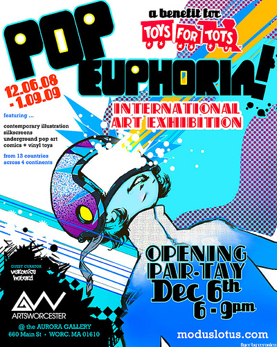
Pop Euphoria!

!!!
Besides me having a piece in this...


It's going to be an amazing show. I'm blown away by the stuff I've seen so far. That kind of compliment doesn't come easily from me. Come by and check out this awesome show Saturday evening. I'm really looking forward to it.

6-9 pm, December 6th at ArtsWorcester
660 Main Skreet, Worsta

Wear your silliest t-shirt.

Dec 2, 2008

Ed Roth Style Poster

I've been pushing this one back for a while now and finally got a chance to start on it. It's for a rockabilly group out of NYC, and they were looking for a retool of an existing image, based off of a Ed Roth Rat Fink style illustration. After about 20 thumbnail sketches I've come up with this…


The design is really busy, but I think the large black areas will calm it down a bit. I'm still not crazy about how the girl looks, but I'm good with the overall direction. And after an hour inking in Illustrator, I'm happier with her...she looks a little like one of Vince Ray's girls.


Updates to come.

Nov 26, 2008

R.I.P.

My trusty Wacom tablet has croaked. While I've had to replace the stylus and nibs a few times, I've used the 4x6 tablet deck itself since early 2003. I figured as a memorial I'd show some of the finer features of the unit, and point out some of my mods.


Firstly, the part I call the Diaper. This is a sheet of paper cut to fit and stretched around the tablet pad. This gives me a permanent sketchpad on a part of my desk that is rarely covered with junk, and rarely disappears when I need to find it. But most importantly, the Diaper creates a mildly coarse tension between the tablet and the stylus. Both items are made of a slick plastic, which of all the people in all the world, only seems to bother me. The Diaper kicks ass, and I replace it every week or two. As you can see by the limited number of scribbles, I'd just taped on a new one.


Nextly, you can see the Diaper straps and the rubber padding. I lost the last of the rubber feet about a year ago and came up with this solution. It reduces slipping, as well as bouncing when pressure is applied to the tablet.


Here is the unit, stripped nude, before I begin injecting the embalming fluid. You can see on the right that the finish is worn completely away, revealing under the sparkly blue? Glossy blue! Wow!


Lastly, the culprit, a frayed, bent-too-often USB cord. Sadness abounds, but not to worry, I have a backup, quickly installed and working aok. Still 4x6, with a new Diaper around it.

Yes, 4x6. Anyone who claims you NEED bigger is mental. Keep your eye on them.


Larger is just more expensive. Keep your money in your pocket. That's yours.

Nov 21, 2008

The right colors...finally


Went and found the proper paper. It seems that the posterboard is being replaced by the recycled, toothy stuff I've been fawning over. I bought almost a whole box of it. It's a bit bluer and not as bright as the posterboard of old, but it makes for a great silkscreen surface, esp with the inks I'm using.

We went down to the studio last night and actually pulled 2 colors on 30 sheets in the intended colors...success.

Nov 19, 2008

The Compromise

So the paper I was using for the first posters was great, with a toothy, recycled-ish, absorbent surface. But I didn't buy it the first time, Nicole had run to the store and gotten it while I wrestled with screens and inks.

Last week, I went back to the store with samples and discovered that it was posterboard. Posterboard. Currently, the various colors of posterboard come in that excellent paper while white remains that cheap, slick, junky crap that anyone can find at CVS. Tick-tock. I decided to print the new poster in a similar palette to the HHH3 poster. Unfortunately the red was designed to be yellow-green, so the small text is a bit harder to read than I would have liked. As a bit of a happy accident, many of the lights in the Lucky Dog are red. This really raises the contrast between the blue and the other colors.


I'll be selling these posters (18x24"), not sure when or how or for how much, probably $10-15 apiece. And I'm going to attempt to print these in the intended colors as well. Cheers,
d

Nov 13, 2008

Bumping this up for tomorrow's event...


So I was asked a while back to participate in a project by my friends Scott Erb and Donna Dufault. They have created a portrait book called 20 Artists of Worcester (and their Work Spaces), of which I am honored to be a part.

To introduce the book Scott and Donna have arranged a show (including book signing). So grab your sharpies, or magnum45 marker if you REALLY cool and squeak this info onto your calendar:

The show will hang at:
The Davis Art Gallery, Printers Building
44 Portland Street - 3rd Floor, Worcester, MA

Opening Reception: Friday - November 14, 2007, 5PM - 7:30 PM

See you there.

Nov 11, 2008

Nifty new project just went to the printer...

We'll see how long until I get samples, and maybe see this in stores. Here's a small sample, can't show too much of this one...

Nov 10, 2008

HEY I HATE THAT STUPID THING YOU PUT UP


YOU HAVE A BUSINESS! YOU PUT UP AN ANIMATED, FULL-COLOR, BRIGHTER!THAN!THE!SUN! ELECTRONIC-LIGHTED CRAPBOX ON THE SIDE OF THE ROAD. !!! IT DOESN'T MAKE ME WANT WHAT YOU SELL. INSTEAD--> IT TRIES TO DISTRACT ME --> WITH A SPINNING SPIRAL --> WHILE I'M DRIVING. IT IS A REAL-LIFE POP-UP BANNER. IT IS AS PISSP@@RLY DESIGNED AS A POP-UP BANNER. IT IS THE SAME RESOLUTION, THE SAME INVASION, THE SAME ANNOYANCE. INVASIVE ANNOYANCE. INVASIVE ANNOY--> YOU ARE A LITTLE-CITY HICK*RUBE*CHUMP WHO WASTED UMPTEEN GRAND THINKING YOU'D MAKE YOUR BUSINESS LOOK LIKE TIMES SQUARE. IT DOESN'T, AND THE DAMN THING IS MALFUNCT1O1O1OOOOIIINING HALF THE TIME ANYWAY. -->!!!
...

Also, if you own a pizza place, do you really need a 42 inch plasma? Seriously, relax.

Nov 6, 2008

O


Life won't be the same without constantly refreshing poll sites. Sigh...I guess I could go volunteer or something...

Nov 4, 2008

306 EV for Obama

I went to the Worcester flea market a few weeks back. there was one vendor who had lots of JFK busts. it reminded me that i used to see JFK busts all the time, everywhere when i was very young.

i get it now.

Jesse Jackson is on camera, but he seems anonymous in a crowd, and he's crying. While I type, John McCain is giving an admirable, honorable ...incredible concession speech.
d

I Voted.


Yeah, I went there.

So, can anyone explain what's so difficult with putting a mark on a piece of paper, pushing it over a scanner into a big locked box. Touch-screens? Really? I guess someone saw someplace they could make a buck or steal a vote.

Monorail! Monoraaaiil!

I expect that tomorrow we'll have at least one YouTube video of some old guy in Ohio or Georgia beating the piss out of an electronic voting machine.

Oct 29, 2008

Chillum Poster Final

I think it's just about done. Not sure what the second color will be, I have it here as a peepee green and blue. I just have to look into printing options...

Click to enlarge.


UPDATED for prettier color. I liked that greenish yellow, resurrected it. For some reason, the cyan wasn't coming out properly from photoshop. Very strange.

Oct 27, 2008

Chillum Poster


I'm about 1/3 done with this poster. Lots more to add, but I'm pilfering time out of my worksched to get er done. It should be done soon, my original sketch is pretty tight, so that makes it easier.

Barack Obama.

Oct 22, 2008

Spot Art is Fun

Especially for Halloween stuff.

FunFunFun.

Oct 13, 2008

20 Artists


So I was asked a while back to participate in a project by my friends Scott Erb and Donna Dufault. They have created a portrait book called 20 Artists of Worcester (and their Work Spaces), of which I am honored to be a part.

To introduce the book Scott and Donna have arranged a show (including book signing). So grab your sharpies, or magnum45 marker if you REALLY cool and squeak this info onto your calendar:

The show will hang at:
The Davis Art Gallery, Printers Building
44 Portland Street - 3rd Floor, Worcester, MA

Opening Reception: Friday - November 14, 2007, 5PM - 7:30 PM

See you there.

Oct 10, 2008

Old Couple

I started this image a year ago, but finally finished it up and am getting some digital prints made and framed with a nice oval-shaped bubble-glassed frame. I'll post an image of the finished piece when I pick it up next week...


Below are the images I'd posted from the original few iterations. I still like the quote, but it needed better color. The other plan I have for this is to do a greeting card, where the inside reads "You're lucky..."


I really like the gentleness in his hands and even in his biting, I'm glad that I was able to carry that through from the initial thumbnail sketch.

Oct 7, 2008

Why Adobe Illustrator CS3 should not be used by anyone, ever.

Click for a closer look.


This makes me nuts. Let's say you're working on a map of the US, you zoom in to adjust California, and when you zoom back out, Maine now looks like Snoopy? No thank you.

Oct 2, 2008

Full Cthulu Poster, In Context

Ultimately, I'm not crazy about this image, but I think it works...

Sep 26, 2008

A Bit More Progress with Cthulu Illustration


So, yeah. Some progress, nothing major, but I need to make a few decisions. Three things...

1. I'm not happy with the area behind her back, her ribbon-ends, her hair and the monster's teeth. It's just really unclear, too much going on there. I like to combine chaos with order, and there's just no order in that space. I may straighten her hair.

2. I need some definition, shadowing or something to un-flatten the sandy space below her bottom.

3. Holding her hair in her left hand is kinda weak, I'm thinking maybe a harpoon gun...

d

Sep 25, 2008

Cthulu Progress


just a screengrab. i'm taking my time on this...stealing a few minutes here and there...d

Sep 17, 2008

Quickie Post - Devil Cartoon


Just a piece of spot art I did for a project today... I installed Google analytics last week and I see that this site gets a good amount of traffic, so I might as well try and keep it current...
d

Sep 15, 2008

New Cthulu-style Sketch


Dig it. I was going to use this in a new poster, but the event apparently has 35 lbs. of info. There's some room for artwork, just enough for maybe one row of space invaders.

Oh well. Maybe next time.
d

Sep 3, 2008

Nosferatu Poster and Illustration Layout Lecture

So here's a bit of the insanity that goes on in my head when working on something like this...


First, here's the quick thumbnails that preceded my color sketch. I liked the quick, gestural black shape of the vampire's body. Because I didn't want to mess with that shape while experimenting with his hand-gestures, each of the hand sketches was a brand new sketch. Erasing over and over to make a single perfect drawing will just make you nuts, while drawing quickly over and over makes you continually rethink the image.

Same method with the female figure. This thumbnail probably took less than two minutes. Roughly piecing together the best elements in Photoshop took maybe 5-10 minutes. Working quickly like this ensures that the final image doesn't become too intricate, and ensures that the viewer can understand the image quickly as well.

No matter how wonderful you are as an illustrator, no matter how much detail you can pour into an image, and no matter how sure you are that the viewer will pull up a lawn chair and wistfully stare at your picture for hours, the reality is that 99% of viewers probably won't give it more than 3-4 seconds. For a poster, billboard or advertisement to be successful, the viewer needs to "get it" in that tiny space of time. Less becomes more.


Moving on to piecing together my color sketch in Photoshop...

For the coloring, it's a bit of the yin-yang design. The color divides up the space horizontally using black and yellow. Black/yellow is often a more striking, higher contrast color combo than even black/white, but on this I opted for a subdued yellow to suggest a sepia tone (though this 1979 film one is obviously full-color).

The poster is generally divided up into three themes, the Female (bright, white, yellow dreamy), the Vampire (black, solid, with that sharp hand invading the Female's space), and the Info. The Vampire's blackness bleeds down to create a clear backdrop for the Info. In the Info space I used a clear, symmetrical, bottom-anchored type layout that denotes the event as a film (and not a band or festival or chili cook-off).

The Nosferatu (Dracula) story is almost an archaeology story. Modern, civilized man is digging up this eastern European supernatural relic, but discovers that the relic is alive and just as curious about modern, civilized man (and woman). Pre-modern versus post-modern. Because I want to place the poster in the same era as the story, I use modern (Futura) and pre-modern (Blackletter) fonts. Also, I used zeroes for the letter O, because Futura's zeroes are perfect circles, to create more of a turn-of-the-century feel.


On the final, inked, colored version, I only made a few changes.

The Female's face became a profile, again for clarity and also to reflect the profile of the Vampire. The Vampire's head becomes a bit more refined and the shape of it changes from a round egg-shape into a parallelogram whose angles point directly at the Female.

The Female's hair no longer flows dreamily around. Now it hangs almost directly down, this makes her body seem to rise directly up from the Vampire's palm.

The Vampire's hand originally was very dark, almost a silhouette. This felt too grubby, so I went in and filled in all the details for the hand and gave it a more 50/50 ratio of black shadow to white flesh. This creates a more real sense of depth, and it makes the fingers more animated, more spidery.

Lastly, to tweak the overall layout I reduced the width of the yellow-colored background, and added a circular shadow into that space. This makes the overall layout seem a bit taller and focuses the viewers' eyes away from the dead black space of the Vampire's body and toward the dreamy/intense space between the Vampire's face and the Female form. The Vampire's body now becomes fluid, connecting the Info to the Female in an elegant fiddle-head shape.

Quiz Monday, class dismissed. Hah.